Sharing is Caring
Here we share our experiences and thoughts about web strategy, social media marketing, SEO & really anything that strikes our fancy.

Common Blunders In Web Design
03 Mar, 2014
"Never interrupt your enemy when he is making a mistake." - Napoleon Bonaparte
Ever forget to put a doorknob on a door you just made? Sure it is aluminum framed with glass and looks extremely classy but what if you forget, let’s say a keyhole? Or perhaps a door that never locks? Those are major blunders one can do on a convenience object and may also sound mind numbingly stupid. These kinds of mistakes one must never make. Web designers also tend to make similar serious mistakes that cannot be compensated even if their web design is out of this universe gorgeous. Yes accidents happen and sometimes they can be covered for but it may not be the case with all mistakes.
Search that cannot correct typo
These kinds of searches are a big no. Agreed a user should type in a correct spelling on the first try but a web search which is case sensitive and punctuation sensitive is like a security guard who wouldn’t let a passenger in unless the identification is clean and the picture on the ID looks exactly like that person. Web searches should be flexible to typos and mistakes made by users and should still be able to generate correct responses most of the time.
Fixed font size
Unfortunately all CSS style sheets deprive web users to change the font size to their convenience (unless the user magnifies the page but users unfortunately don’t like scrolling sideways either. It's already enough they have to scroll down.) The size needs to be defined appropriately as well and small fonts may not do well with the users spatial endurance.
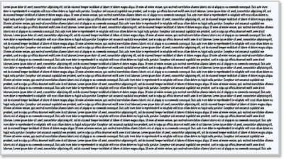
Too much text clutter
Too verbose paragraphs with no sub headings and bullets should be avoided at all costs. No one would particularly enjoy reading long stories on their desktop. Users need to be able to scan the text and skim through the content without losing themselves in it. They will be more like to give up halfway and look for another webpage.
PDF pages
Users particularly dislike their workflow to be disrupted and will certainly not be amused with being redirected from an HTML page to a PDF page unless that document needs downloading. If the information can be presented on a webpage then the user would rather avoid the hassle of downloading the PDF file and have web designers avoid the laziness of merely embedding that PDF file instead of making another page.
Hyperlinks that do not change color
Users have a bad memory. They need to know what link they visited especially when they find too many links clustered together (like a site with too many stream links of a show). Websites with hyperlinks that do not change color once they have been visited will annoy the users.
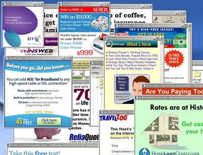
Unnecessary links, popups and advertisement
Too many adverts and popup windows will be like a pushy salesperson dangling hair product on a customer’s face and practically pleading that customer to make a purchase, hence scaring them off. One wouldn’t want to scare their customers off by too many annoying adverts and popup windows. Also viewers don’t like to be redirected to different web pages and form a clutter of webpages on their web browsers.
Bad customer feedback system
Viewers will absolutely stop visiting that websites who do not get back to the queries and feedbacks. Hollering in an empty room will be of no use of course.
Last but not the least, no consistency in the web design
This probably may be the most serious blunder which completely destroys the first impression and the image made by that business.
The key is to be meticulous and thorough in the work one does. 4M Designers are extremely cautious of these blunders that can absolutely ruin the web user experiences so try us out!

Established in 2003
4M Designers is a family backed creative digital agency. Our culture is rooted in a deep purpose, solid values, and inspiring philosophy. Our services are focused towards producing outcomes, not outputs. We start with the heart, and always put strategy before execution. We have worked with companies of all sizes. Our work is our footprint. It's our business, our passion, our calling, and our expertise. This is what we do. Let's get started.
Follow @4mdesignersWhat we offer
Number of ways to reach us
Suite No. 119
Techno City Office Tower
Off I.I. Chundrigar Road
Karachi 74000 - Pakistan.
E-mail: contact@4mdesigners.com
Phone (9-5): +92-21-3-221-4110
Phone: +92-321-2323-717
Download our Vcard